Open your website on your phone right now.
How many seconds does it take before something meaningful shows up?
Not the header.
Not the logo.
Your actual content.
Those few seconds decide something much bigger than load time, they decide whether your SEO efforts will even matter.
Mobile speed has quietly become the force behind visibility, user trust, and conversions. And the reason is simple: search behaviour has changed faster than most websites have adapted. People now access the web with the same expectation they have from apps, instant, smooth, effortless. When your mobile site can’t keep up, Google sees the consequences long before you do.
This isn’t a technical debate anymore. This is a user experience signal that determines how your entire marketing ecosystem performs.
Want to improve these signals the right way? Explore our Ideas to Reach SEO Services now.
The shift is subtle but powerful.
A decade ago, users "navigated" websites.
Today, they evaluate them.
Within the first two seconds of landing on your mobile page, users subconsciously answer questions like:
Does this brand feel credible?
Is this website safe and updated?
Do I want to continue or go back?
They aren’t thinking about your design, your copy, or your SEO strategy.
They haven’t even seen those things yet.
They’re reacting to one thing: speed, the very first impression your brand makes online.
When users hesitate, bounce, or return to the search results, search engines read it as:
"This page didn’t satisfy the user quickly enough."
And that directly influences ranking.
Your keywords, metadata, links, and content quality come after this moment.
Mobile speed filters everything else.
To understand why user behaviour matters so much, explore how tiny SEO triggers lead to large outcomes in our breakdown: The Tipping Point in SEO: Small Actions, Big Results
Search engines moved to mobile-first indexing years ago, but the impact became more visible only recently. More than half of all online interactions start on a phone, and these interactions are shorter, faster, and far more impatient.
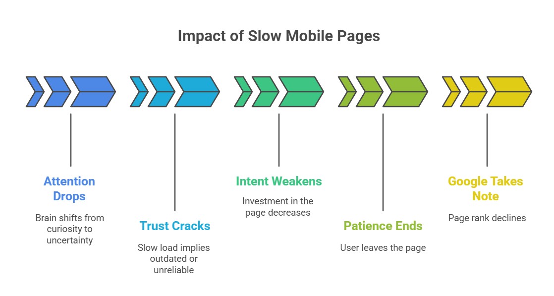
A slow mobile site doesn't just inconvenience a user.
It creates a measurable ripple effect:
Higher bounce rates
Lower dwell time
Reduced interaction
Fewer conversions
And eventually, weaker rankings
This is why high-performing websites today have one thing in common: they treat mobile speed as a brand standard, not a backend task.
A fast site feels modern.
A slow site feels neglected.
That perception directly influences how people, and Google, respond to your content.
Here’s how a slow page triggers a chain reaction (visual overview):
Core Web Vitals sound technical, but they’re simply Google’s way of asking three human-friendly questions:
1. How fast does something meaningful appear?
Users don’t care about loaders. They care about content.
Google specifically measures this moment through a metric called Largest Contentful Paint (LCP), which checks how long it takes before the main, usable content becomes visible.
To dive deeper, read our complete guide to LCP and how it impacts SEO
2. How quickly can someone interact with your page?
Menus, taps, buttons, forms, if these feel sticky, heavy, or delayed, Google assumes the experience is frustrating.
This is what Interaction to Next Paint (INP) captures: the real-world responsiveness of your page when a user tries to take action.
3. Does anything shift suddenly while the page loads?
When layouts jump around, buttons move, or text shifts mid-scroll, users immediately feel irritation.
Google evaluates this using Cumulative Layout Shift (CLS), which measures how stable your layout is as it appears.
In simple terms, Core Web Vitals are not developer metrics.
They are user expectations turned into numbers, a direct reflection of how comfortable, smooth, and trustworthy your website feels on a phone.
Before you even open PageSpeed Insights, perform the simplest test on your phone:
Does the page appear quickly enough to keep you engaged?
Do you wait for images or text to settle?
Does tapping a button feel immediate?
Does the site feel modern or sluggish?
If you feel friction, your users feel it too, and Google reflects that back in rankings.
Here’s the truth: speed issues rarely come from one big problem.
They come from a collection of small inefficiencies that build up silently.
Compressing and resizing heavy images
Removing unused scripts and plugins
Reducing layout-heavy elements
Simplifying mobile navigation
Prioritizing visible content
Using efficient font loading
Minimizing third-party integrations
Strong caching
CDN delivery
Minification
Preloading critical assets
Lightweight frameworks
Modern image formats like WebP/AVIF
When these two layers work together, mobile speed dramatically improves, and so do user signals.
Then the problem isn’t your website.
It's your hosting environment.
A slow server creates delays that no amount of optimisation can mask.
Poor hosting affects:
Time to First Byte
Overall responsiveness
Stability during peak traffic
Google’s ability to crawl and index your pages
Many sites look “okay” on desktop but fail instantly on mobile purely because the server takes too long to respond.
In 2026, good hosting isn’t an upgrade, it’s a requirement for SEO.
You can have powerful content, a strong keyword strategy, and world-class on-page SEO…
but if your mobile experience is slow, none of it reaches its full potential.
A fast mobile site:
builds trust
reduces friction
drives conversions
signals quality to Google
amplifies every SEO effort
A slow mobile site does the opposite, quietly, consistently, and expensively.
In 2026, mobile speed isn’t a technical metric.
It's a business metric, a brand metric, and a growth metric.
And the websites that win are the ones that understand this early.


Please send a WhatsApp message only. Kindly do not call :
+ 91 - 99 4040 1010 | + 91 - 94 97 40 1010
Email: [email protected]


