Choosing the right image size for your blog posts is more than a design choice — it directly impacts user experience, mobile compatibility, load speed, and SEO. But with so many “recommended” sizes floating around, what really works across all devices without needing extra cropping or coding?
At Ideas To Reach, we've tested multiple formats and found one that works seamlessly across desktop, mobile, and tablet:
Let’s explore why this format is your best bet for a clean, scalable, and consistent blog experience.
The size and shape of images in your blog affect:
Small details like image size can create a cumulative SEO advantage, as explained in our blog on SEO Tipping Points.
Aspect ratio is the relationship between an image's width and height.
A 4:3 aspect ratio means the image is 4 units wide for every 3 units tall.
Compared to the commonly suggested 16:9 ratio, 4:3 gives you:
This helps maintain visual integrity, especially when you're adding visuals as discussed in our Purple Cow SEO guide.
The added height helps your image:
Learn more in our guide on AI content formatting.
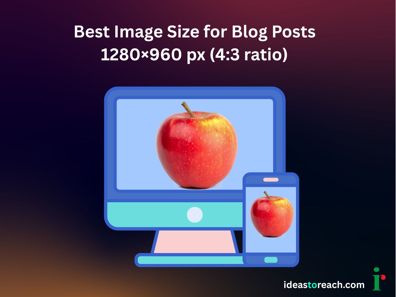
1280 × 960 px images:
See how layout consistency improves internal linking for SEO success.
From Chrome and Safari to tablets and desktops, this size maintains a consistent visual experience across:
Use one format for:
It keeps your blog visually aligned — like we recommend in how often to update your site for SEO.
We tested both 1200 × 675 px and 1280 × 960 px across mobile, desktop, and tablets. Results:
Our findings align with the philosophy of Blue Ocean SEO: do what works better, not what everyone else is doing.
Ensure logos, products, and faces are centered. This prevents loss of key details on smaller screens.
Use:
Keep file size under 150 KB for performance — a vital factor in ranking for AI overviews.
Example:
This follows E-E-A-T guidelines and helps indexing.
A: 1280 × 960 px with a 4:3 aspect ratio — great for desktop and mobile alike.
A: It maintains visual height, avoids shrinkage on mobile, and feels more balanced.
A: No. 1280 × 960 px scales well across all screens, saving effort.
1280 × 960 pixels fits naturally into most CMS layouts without extra styling. It minimizes cropping issues and maintains consistency across themes and templates.
Image size affects page speed, user experience, and engagement. Well-optimized images load faster, reduce bounce rates, and support better search visibility.
Tired of images looking awkward on mobile or needing different versions for every platform?
Go with 1280 × 960 px (4:3 aspect ratio) — and you’ll:
Ready to optimize every post? Explore more tips on the Ideas to Reach Blog or learn more about our team — trusted digital marketers based in Chennai.


Please send a WhatsApp message only. Kindly do not call :
+ 91 - 99 4040 1010 | + 91 - 94 97 40 1010
Email: [email protected]


